The color of a door affects how the whole room is perceived: it can expand the space, emphasize the architecture or become the main accent. In 2026 the door palette balances between calm natural tones and bold rich colors.
Natural shades
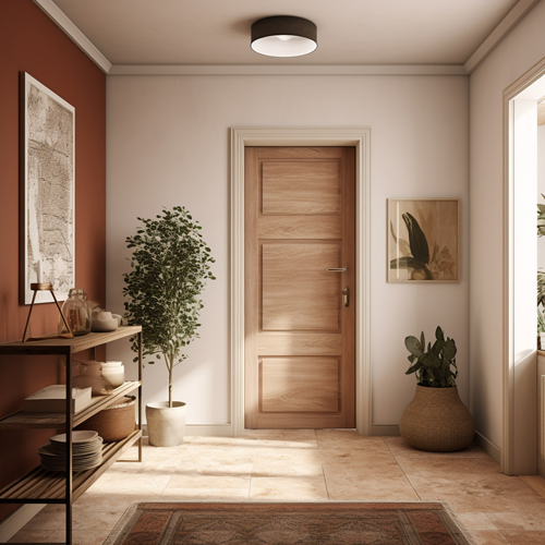
Light wood and warm textures. Wood tones — light oak, walnut, honey shades — remain the most popular. They add warmth and pair easily with different styles
Tip: wood doors look best next to parquet, linen and calm wall colors.
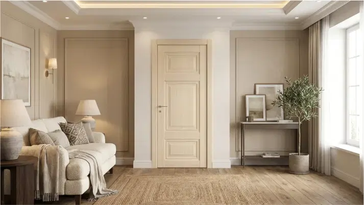
Light and neutral
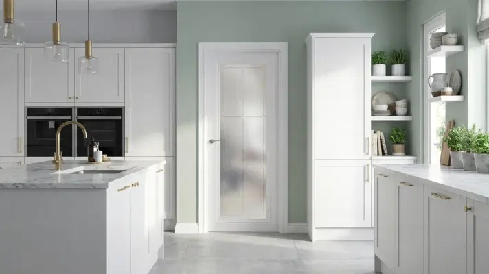
White, milky, beige — calm light tones are still among the favorites.
A light door visually expands the room and adds light. These colors suit minimalist, Scandinavian and neoclassical interiors.
Idea: a light door in the wall color almost disappears into it — a trick that works especially well in small apartments.
Deep dark colors
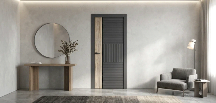
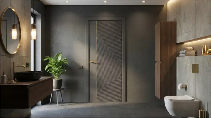
Graphite and matte black. Dark doors create contrast, emphasize the opening and make the interior stricter. It's the choice for those who love graphics and clean lines.
Tip: a black door looks striking on a light wall and paired with dark metal hardware.
Shades of green
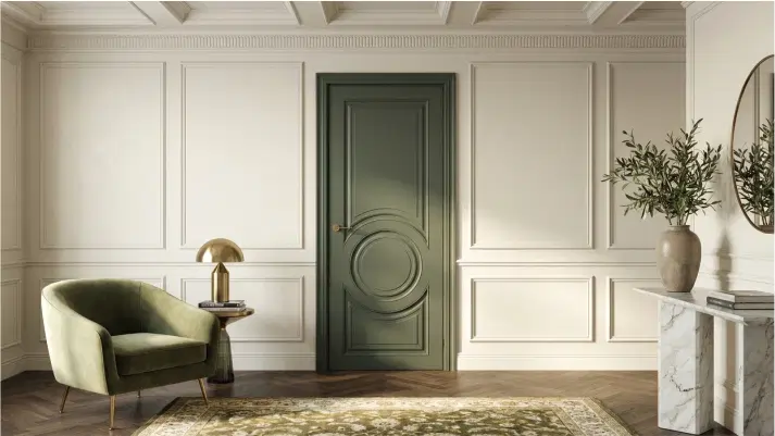
From sage to deep forest, green tones reflect an interest in nature and calm. They work well next to wood and soft textiles, in open-plan spaces and wherever a visual pause is needed.
Bold accents
Navy, bordeaux, terracotta. Rich colors make the door the main accent of the room without overwhelming it, as long as the rest of the finish is calm.
Idea: an accent color is great for a door that leads somewhere special — a study, bedroom or living room.
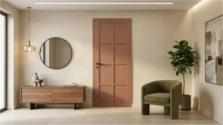
The door color is part of the overall story of the interior, not a separate decision. How to choose a color room by room:
Living room and shared areas — light and neutral tones to keep a sense of space.
Bedroom and study — deep colors for coziness and focus.
Relaxation areas — wood tones.
Kids' room — green and pastel tones.
Enamel from the RAL and NCS palettes lets you match any of these colors precisely to your interior.